Hammer Museum
Art Museum | Branding and Exhibit Design
The Hammer Museum is an art museum and cultural center in Los Angeles known for its artist-centric and progressive array of exhibitions and public programs.
I enjoyed having the opportunity to visit the museum and the perspective it provided me in my process of designing. After visiting and researching it’s history, the common thread of duality stood out to me and became my concept for my hypothetical rebranding of the Hammer Museum.
This is a personal project and is not affiliated with the Hammer Museum
Before I start any project, I begin with research and mind mapping to see what possible connections I can find to drive my design.
Research and Ideation
The Hammer Museum is named after Armand Hammer but I still was interested in the definition of ‘hammer.’ This led me to a connection between a hammer as the thought and “that which affects change.”
An important moment of discovery came while researching the origin of the name ‘hammer.’ The word refers to ‘a maker’ and this sparked a connection in my mind between the artist’s as makers and the museum as a maker.
From my mind map, an important word of ‘duality’ came up when I was thinking about the inside and outside space of the museum.
That led me to further ideate on the ways the museum represents duality. I also found the word nexus to be important, since the museum served as a platform for artists and ideas.
My next step was to gather images that represented the two words to serve as formal inspiration when sketching logos.
The courtyard itself, lined by wide arcades and terraces, is a rectangle broken into two off-center sections. This shape inspired my logo development.
My driving concept behind the logo was to represent the duality of the Hammer Museum. I realized the name of the museum was unique since it had two M’s perfectly splitting it’s form. And the word Hammer and Museum both have six letters.
Logo Development
Round 1 of Logo sketches (digitized)
Round 2 of Logo, adding in full lockup and color
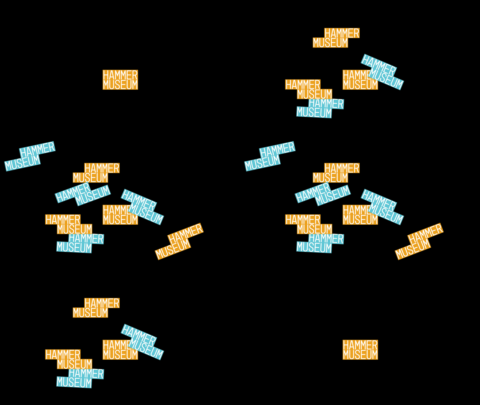
I created these shapes based on the shifting of the two words in the logo.
The shapes are utilized to organize and hold information about the categories of work in the museum's collection. They also expand into system patterns.
Final Logo
The final logo represents the idea of duality with the two M’s stacking vertically. It is also represented in the shifting of the two words to visualize two things coming together and how art can shift our perspective. Lastly, it connects to the architectural stripes of the building and courtyard design.
BEFORE
AFTER
Inspired by my research, I created messaging for the museum featuring the idea of makers and the museum being a space where ideas come to life.
Poster Application
Print Application
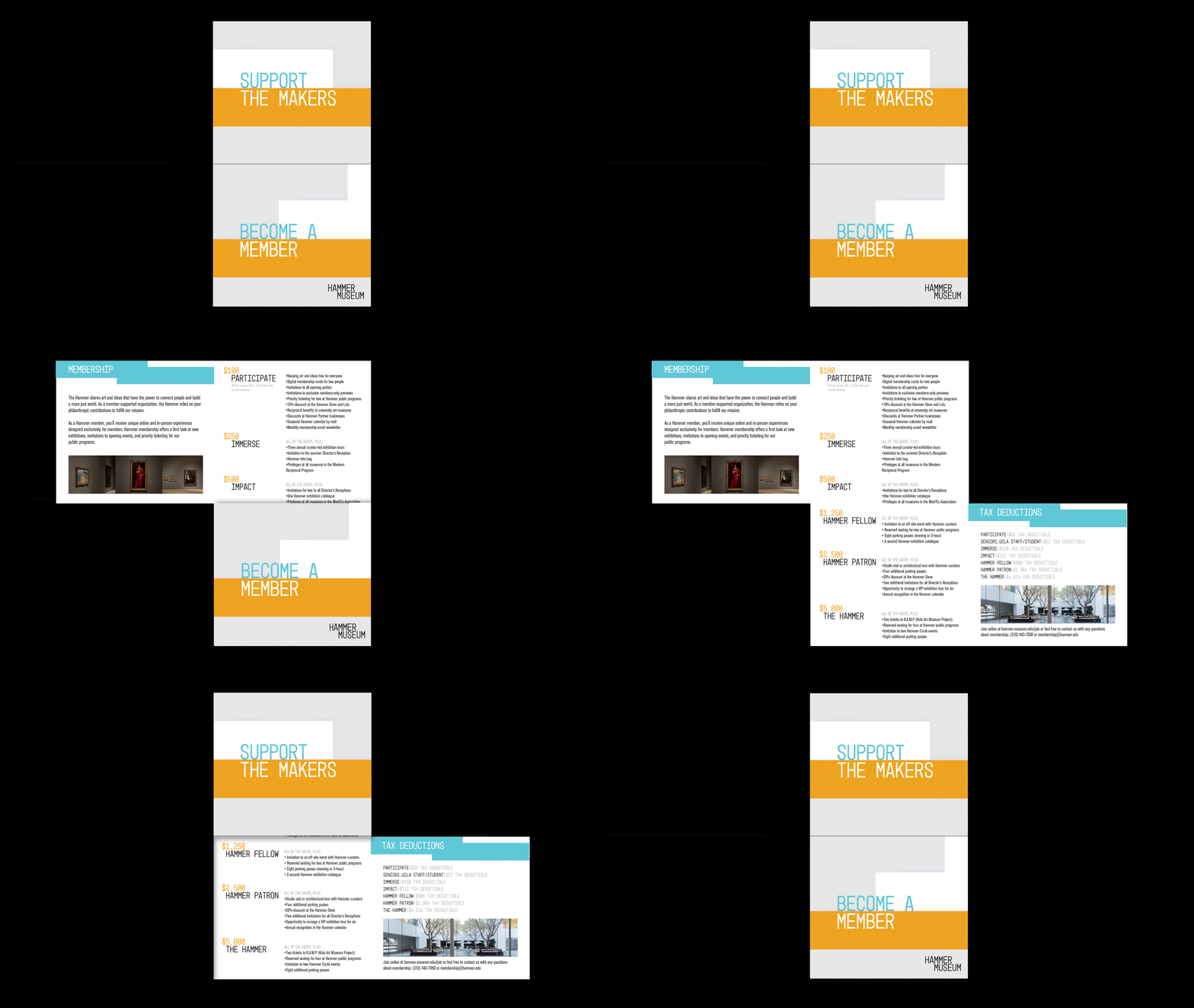
I designed the member pamphlet to open up and create the stacking shape of the logo.
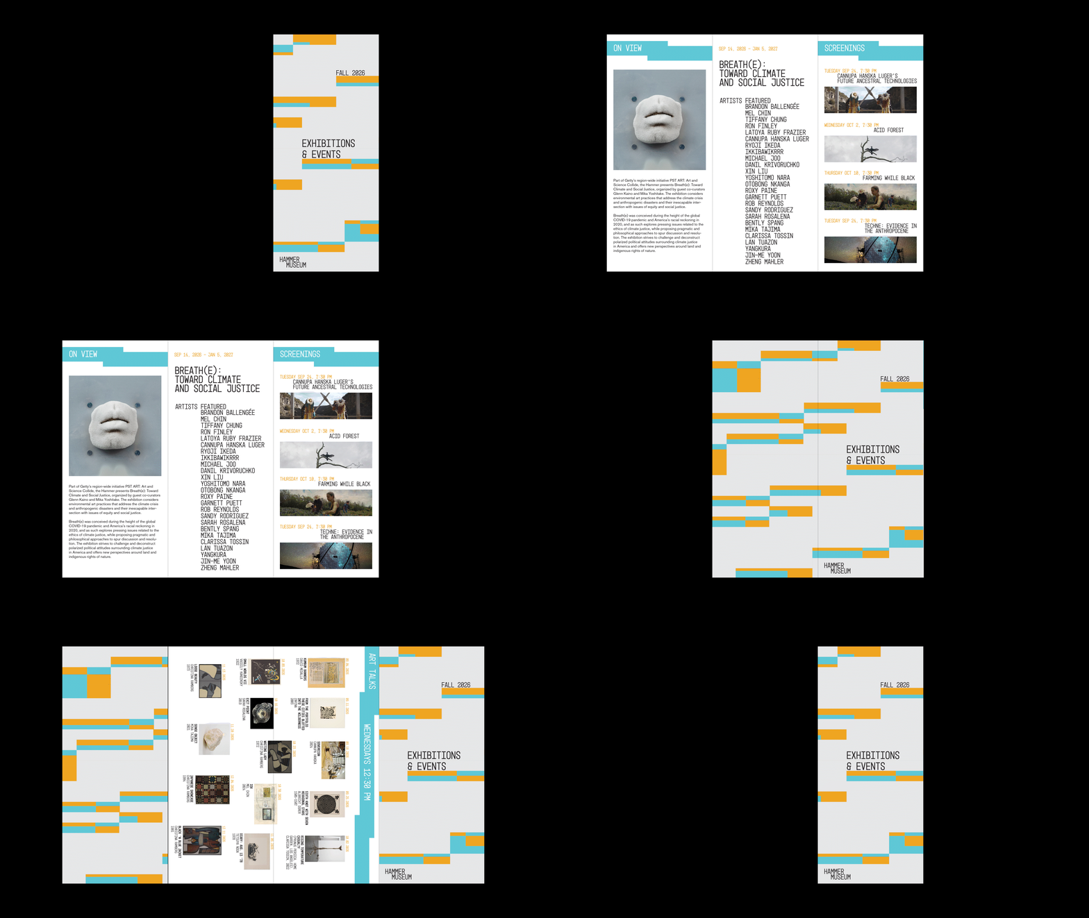
The pamphlets fold to reveal a connected pattern on the front and back pages.
The Hammer Museum is committed to free admission. Instead of tickets, visitors will receive a sticker of the stacking logo as their ‘ticket’ that they can collect.
The graphic system is flexible and expands into way finding. The shapes adapt to emphasize messaging and visualize the duality of the Hammer Museum.
Spatial Application
Exhibition Design
INTER-TWINED is an exhibition that I curated on synesthesia. It features artists, musicians and chefs with synesthesia. I created a graphic system of colored orbs to represent different sensory experiences and how they connect or interact in a synesthete’s mind.
The poster series utilizes thin lines which allude to visual representations/diagrams of synesthesia in the brain.
These are some my visual inspirations for the exhibition design.
The exhibition booklet highlights each artist’s work and their unique experience with synesthesia. The size is portable and easy to view while exploring the museum.
INTER-TWINED Website
The graphic elements are emphasized on the web, spinning and increasing in size to further visualize synesthesia. The website allows users to easily explore the artists and events featured at the exhibition.
AFTERTASTE Dining Experience Design
AFTERTASTE is a hypothetical exclusive dining experience that I conceptualized and created for the INTER-TWINED exhibition. It is a once in a lifetime experience of synesthesia, featuring a delicious meal by two synesthete chefs, live performance by Hans Zimmer (a synesthete) and will leave with a menu documenting their unique experience of each course.
The courses are associated with music terminology. As each course is served, the name appears on the plate as the live music shifts. Guests will enjoy their meal and use the colored pencils provided to fill in what color they taste.
The lights are intentionally dim and the plate is colored with red lighting to obscure the guests’ senses of the food they are eating. This is designed to mimic and invite the feeling of your senses being intertwined, in essence to experience a form of synesthesia.


