Libby
Digital Library | Branding and Motion Design
Libby is a free app that connects to your local library and allows you to access digital books, audiobooks and magazines. The design goal was to create a visual system that appeals to a demographic of life learners.
Through my rebrand, I captured the excitement of reconnecting with the library and reading. This project was meaningful to me because during the process, I personally reconnected with my love of reading.
This is a personal project and is not affiliated with Libby
Brand Introduction and Promotion
This one minute video is a promotion for the audiobook feature of libby. It introduces the graphic elements and layouts of the system. It also speaks to the tone and energy of the target demographic, always on the go.
The video is structured in three chapters:
Chapter 1: Libby brand introduction and teaser of stories in unexpected settings.
Chapter 2: Exploring audiobooks and the exciting journey of reading.
Chapter 3: Where reading takes you and how it enhances our imagination.
Video has audio, please put volume up
Live action photography is used to portray the imagination of reading. Beginning with posters placed in unexpected settings and ending with imaginative spaces.
These images reference where our minds go when we are reading books. The images also reinforce the tagline: learn anywhere.
Motion Storyboard
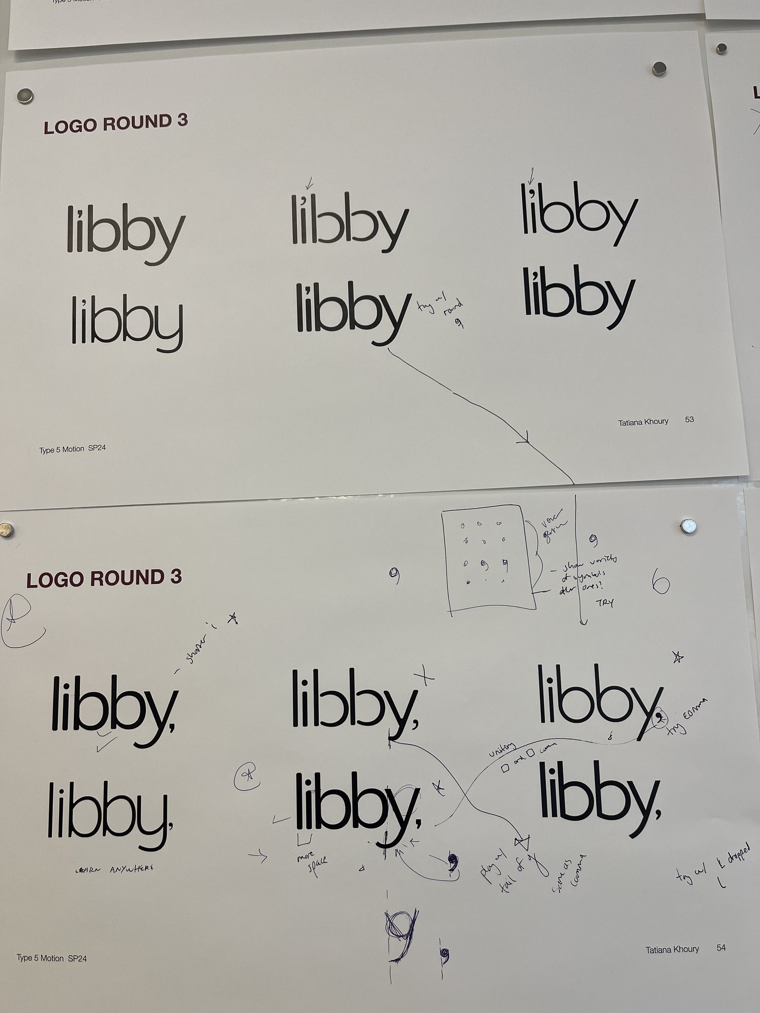
The new logo embraces a modern view on the library, in contrast to the previous logo that references a young child. The new logo type is friendly, approachable and references a digital platform.
The dot of the ‘i’ is replaced with a comma to represent the idea of continuing where you left off and reconnecting with the library and reading.
Logo
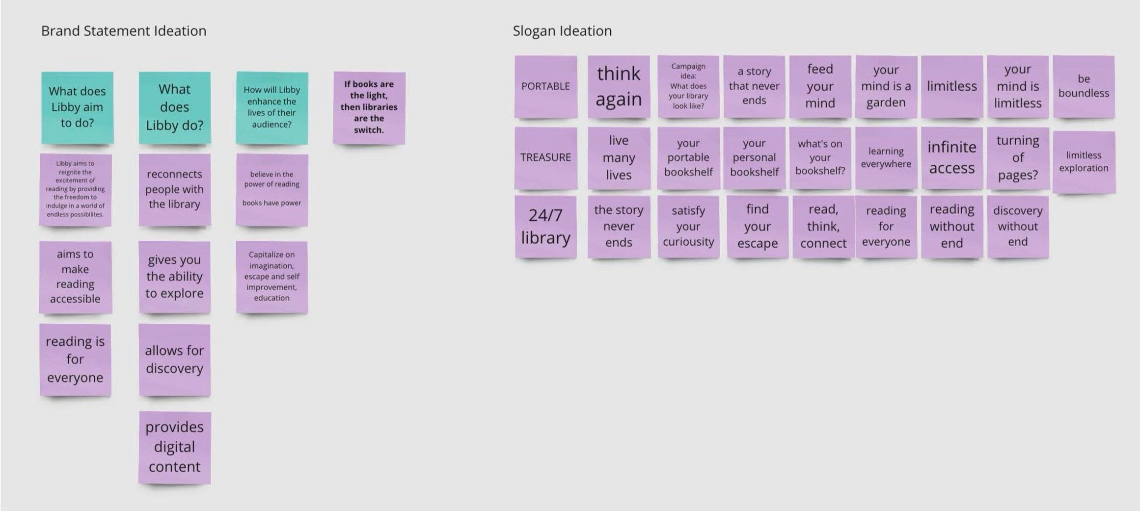
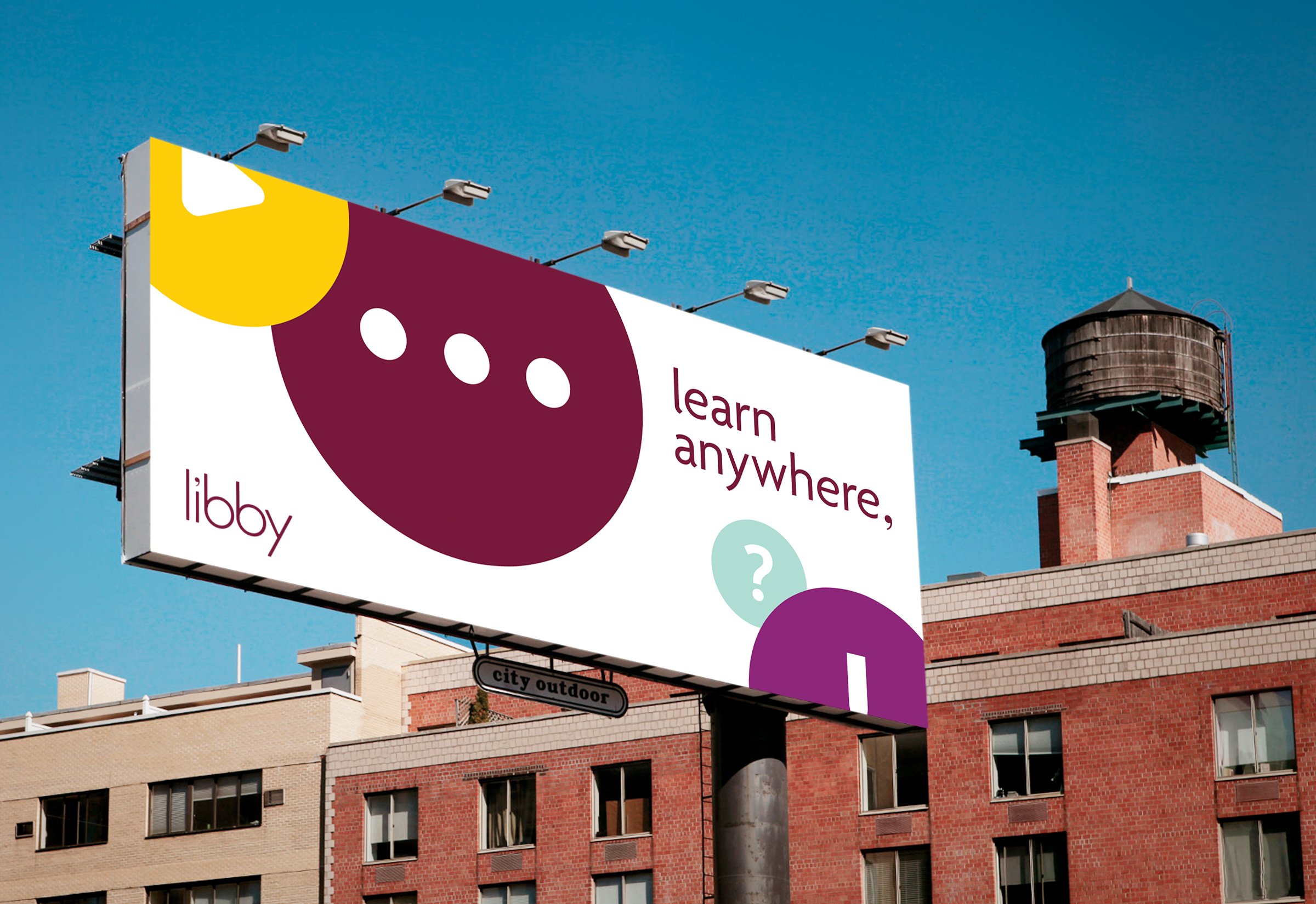
I created the tagline “learn anywhere,” to speak to life learners and an active audience with a busy lifestyle. The tone is practical and utilizes simple language to inspire growth and emphasize how easy learning can be with libby.
Tagline
BEFORE
AFTER
Graphic Elements
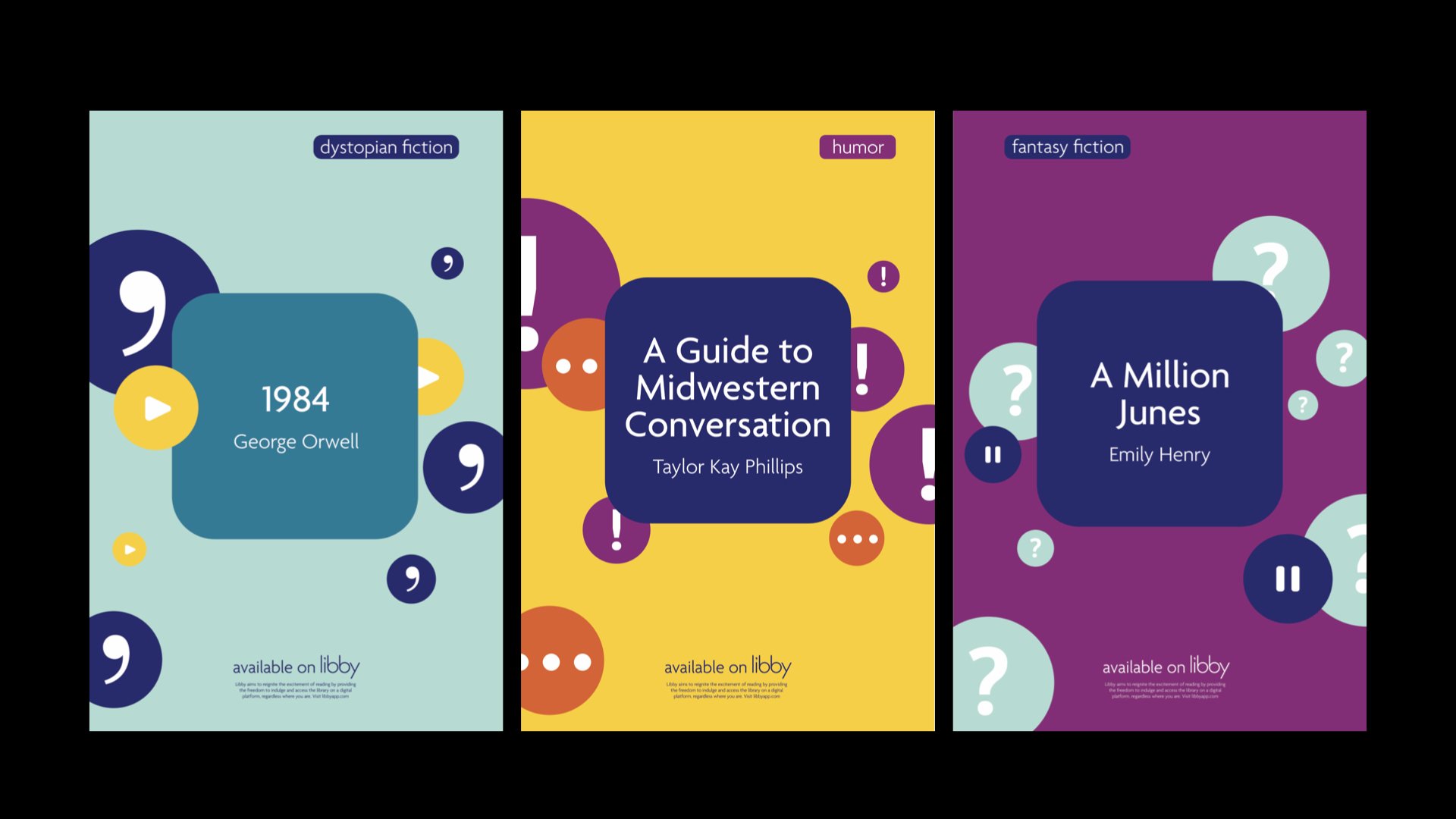
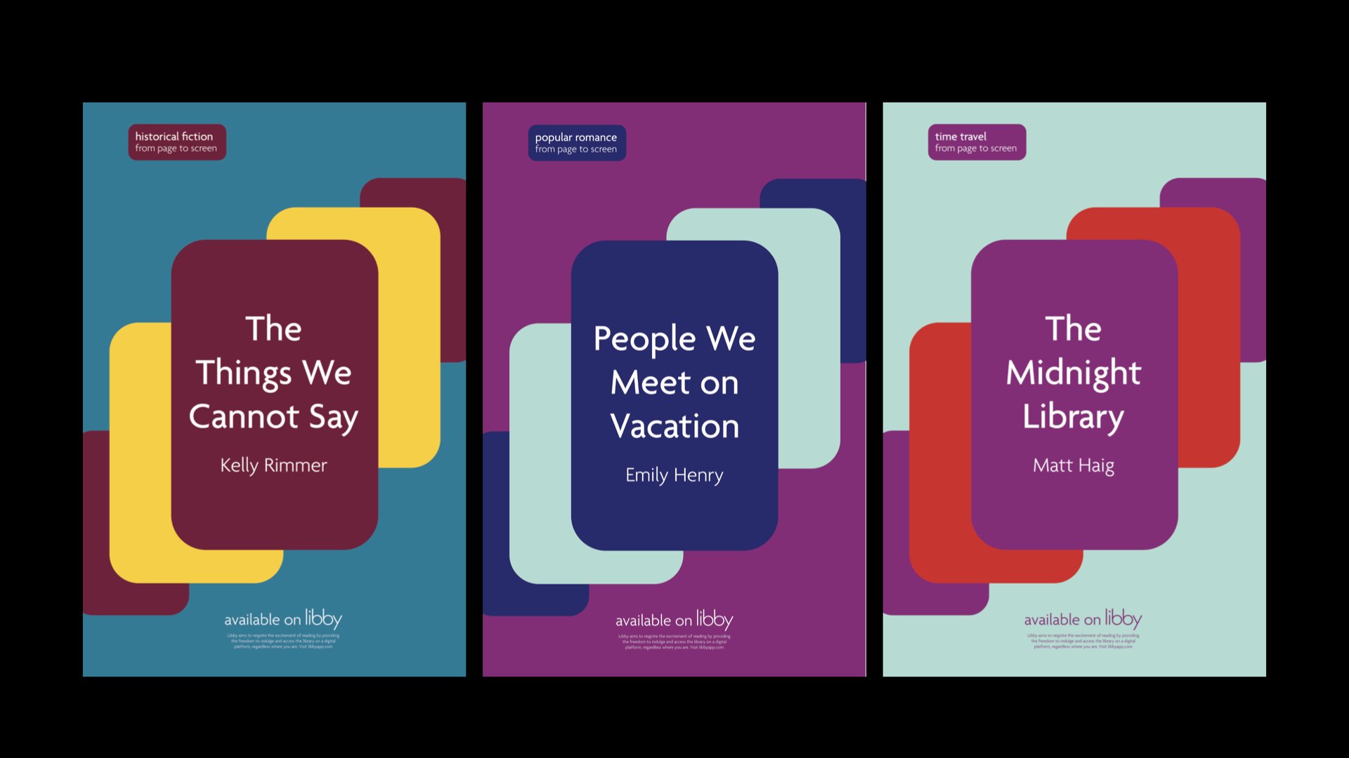
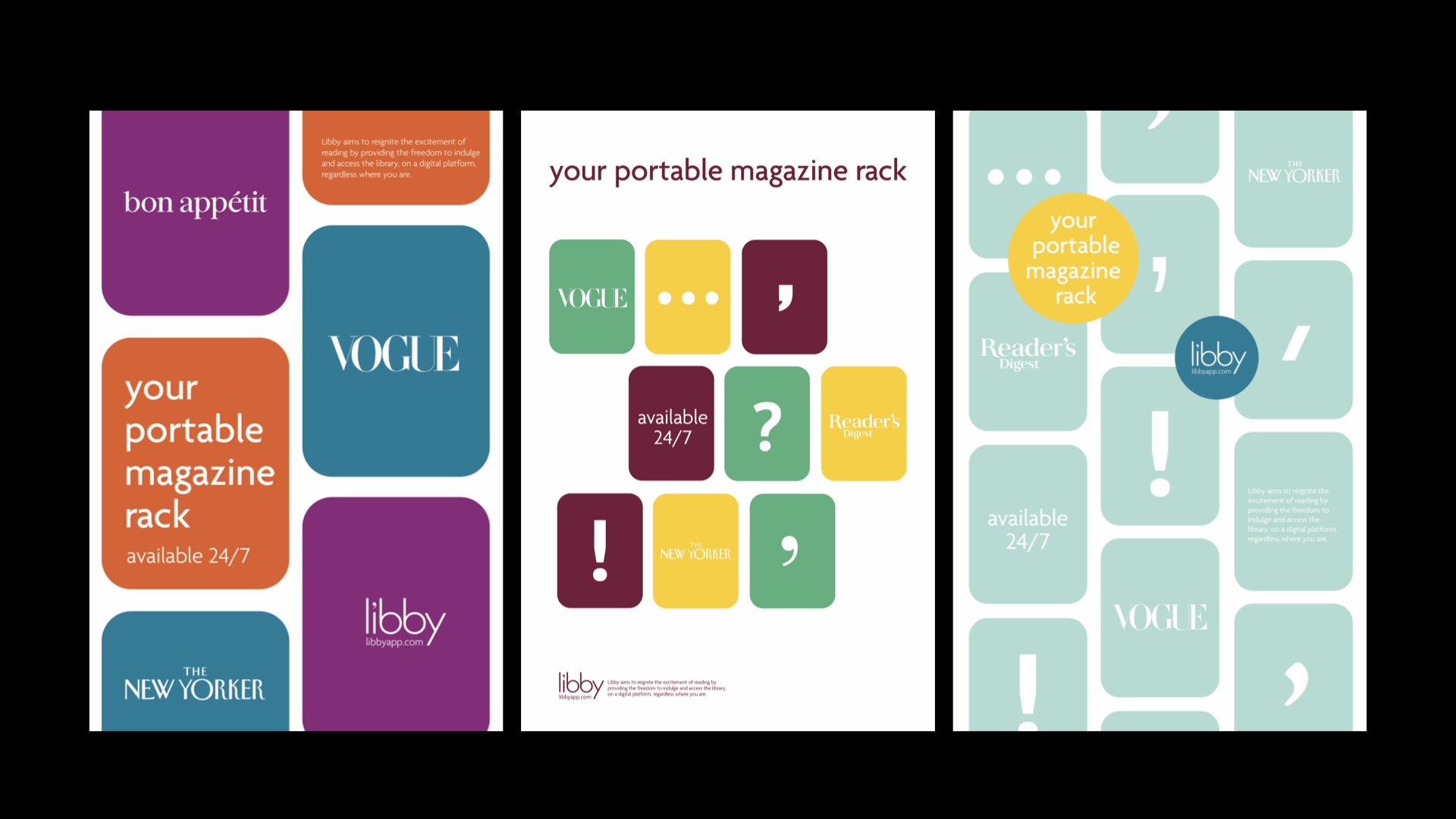
The rectangular forms reference the aspect ratios of each of the offerings and provide stability. The curvature refers to the offerings being digital and the punctuation visualizes the variety of offerings libby has.
The circular forms represent how it feels to read something. They portray ideas, thoughts and emotions. They represent our imagination and their behavior is spontaneous, energetic and playful.
For my rebrand, I chose to not use any photography in printed assets so that the integrity of libby’s content was not compromised by the quality of cover designs. Covers of books, audiobooks and magazines are only utilized on the website or app.
I utilized colors that represent the feelings we experience while reading. The colors provide clarity but also excitement and curiosity, just like the stories we read.
Poster Applications
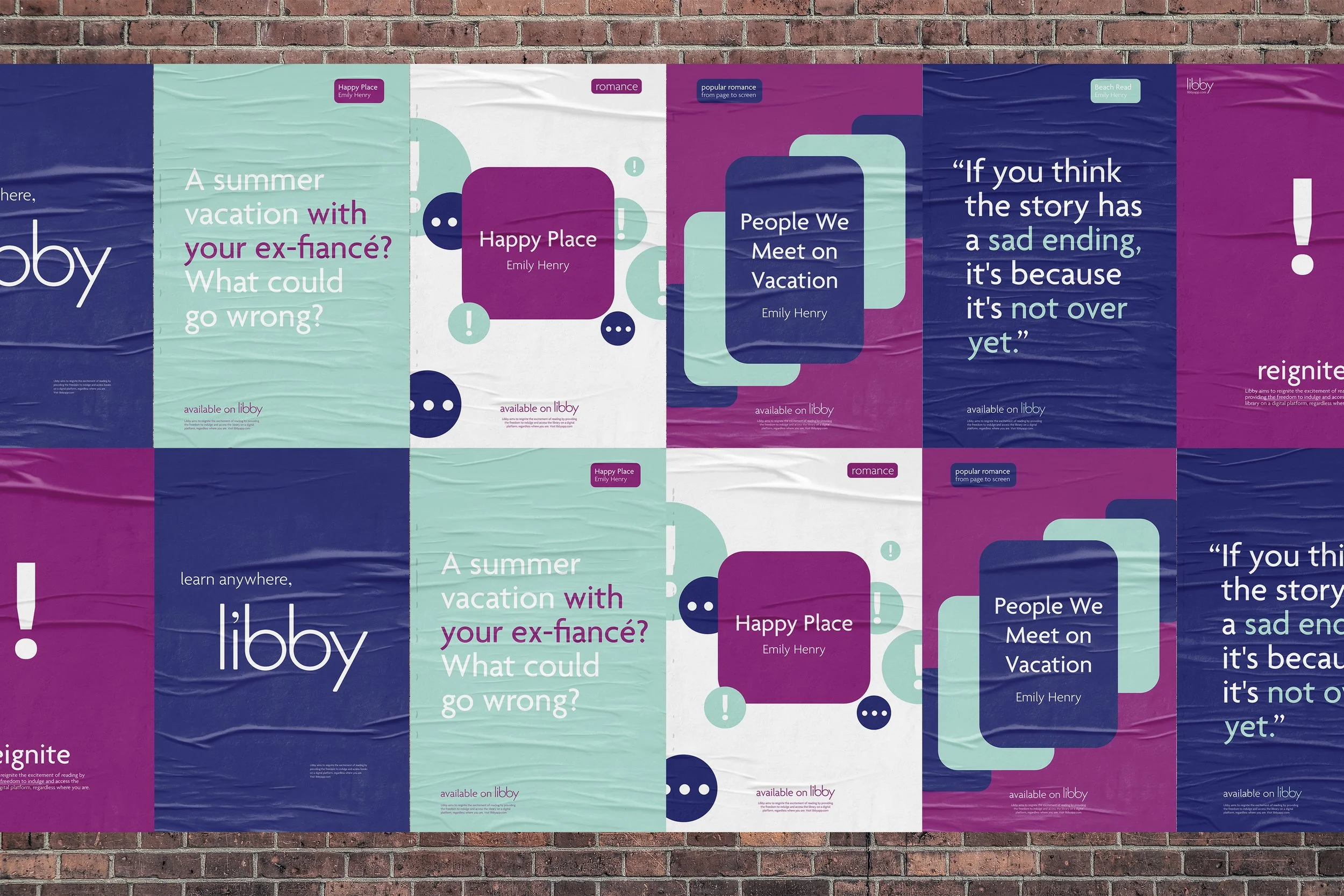
I utilized interesting first lines from books and quotes to activate the viewer’s imagination and tease a story in their mind.
The system is extremely flexible to adapt to different titles, genres and promotions. This is an example of how the system can be utilized to promote a specific author. By utilizing a limited color palette and a combination of quotes, teasers and awareness posters.
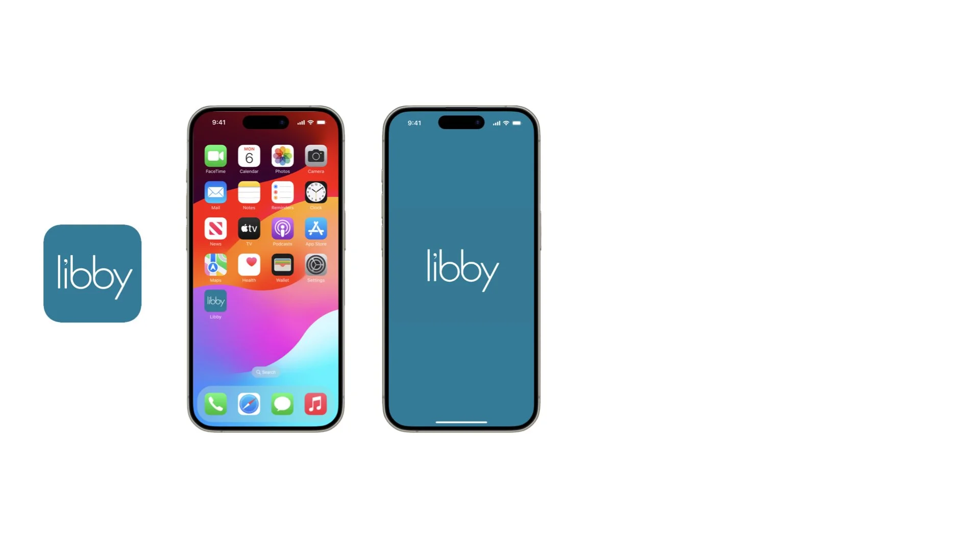
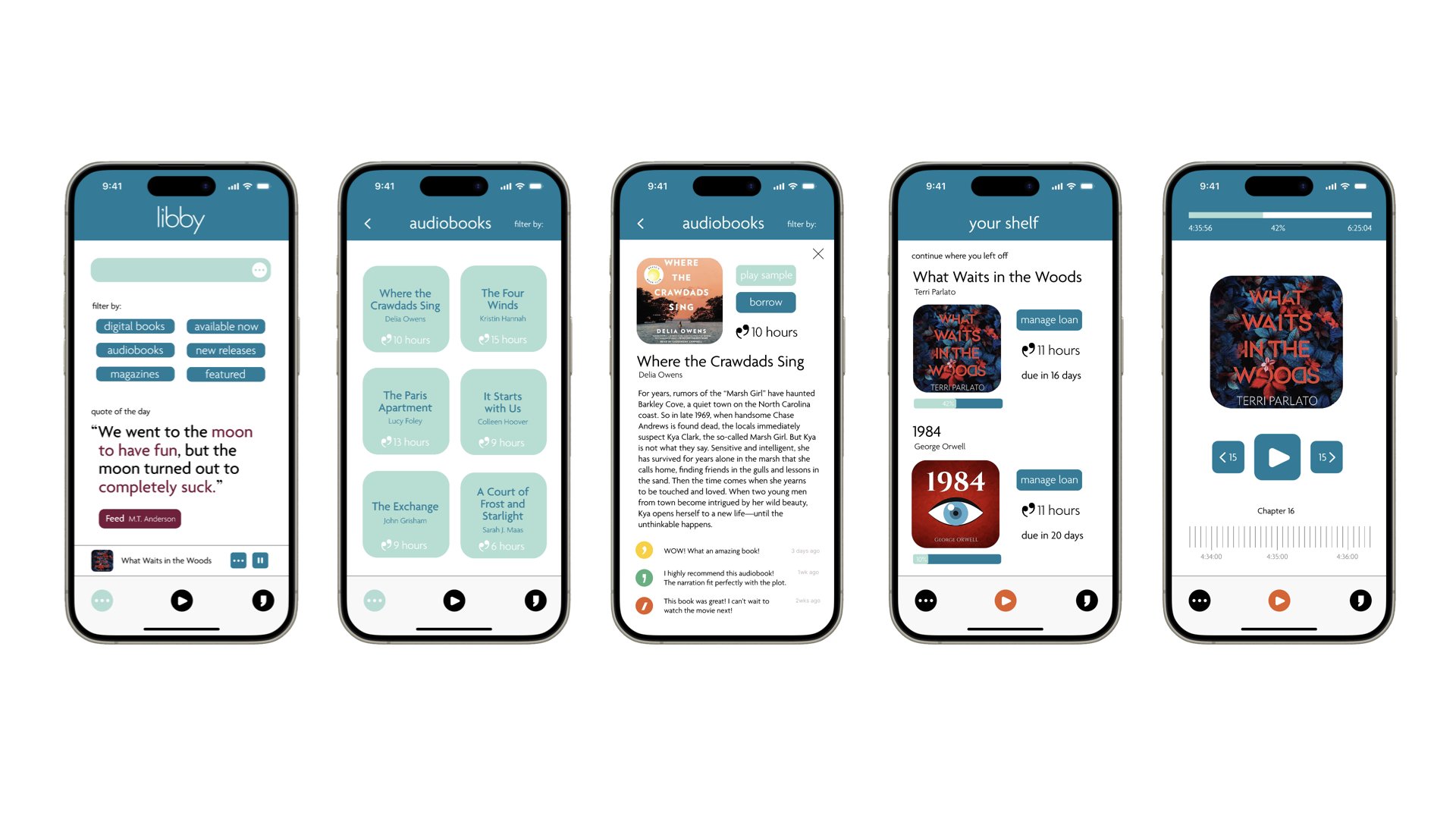
App
My proposal is to allow users to leave reviews of books on the app to grow the libby community and share their passion for learning.
